Younger, more modern and more emotional: Bahlsen wants to adapt the iconic Leibniz brand to the spirit of the times with a relaunch in its anniversary year. The biscuits are to take centre stage.
New font, new colours and a new product image: For the first time in over 10 years, the LEIBNIZ butter biscuit pack has undergone a comprehensive redesign. Design Relaunch undergone. The changeover of all Leibniz packaging to a fresher look will take place successively in Germany and internationally from August. In Austria, the new design was already introduced to the market in June.
„The LEIBNIZ butter biscuit, which is celebrating its 125th birthday this year, has always managed to stay young, attractive and crisp over the decades. That's why it's important to keep refreshing the packaging design and adapting it to the spirit of the times,“ explains Michael Hähnel, Chairman of the Management Board of Bahlsen Germany, Austria & Switzerland.
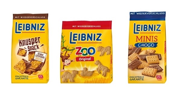
In future, the biscuits will take centre stage visually. The large, delicious product images are intended to whet the appetite and increase the incentive to buy. The Revised colour scheme improves recognisability on the shelves and makes it easier to differentiate between the different types of biscuit. At the same time, it looks lighter and fresher than the original design: the brand appears more modern and younger.
The Logo of Leibniz was also slightly updated as part of the design overhaul: The red box that previously framed the brand has been integrated into the logo as an underline.


