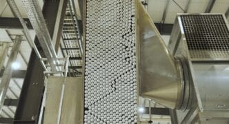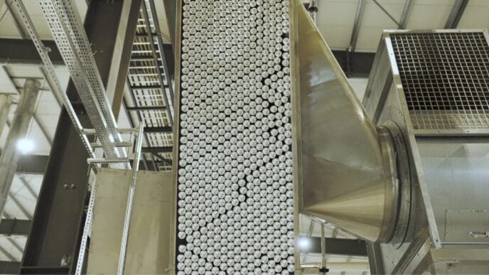


The modern beverage can offers a wide range of design options. However, printing on this packaging material is anything but easy. Technological aspects are just as important as legal requirements. Ball Beverage Packaging Europe supports its customers at all stages of the design process: design, pre-press and printing.
The challenge in the design of Beverage cans The challenge lies in creating sophisticated designs while taking into account all the possibilities and limitations of printing technology. In addition to technological aspects, legal requirements must also be observed, such as the size and positioning of barcodes, symbols or nutritional information.
Ball Beverage Packaging Europe with its European headquarters in Luton, UK, has extensive experience in the entire design process. The company, which is part of the US-based Ball Corporation and has production sites in numerous European countries, supports its customers with a wide range of requirements: from simple logo design to a complete Brand redesign. Three examples show the possibilities that can be opened up in can design.

")
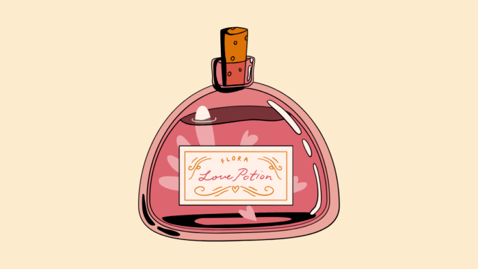
Laško Union - from paper to cans
Craft beer brewers attach great importance to identity and character. Authentic and handmade - this is how the packaging for the new unfiltered beers from the Slovenian beer brand should look. Laško Union look. That's why the company contacted Ball with an unusual idea: „The customer came with a piece of printed Paper banderole to us,“ recalls Richard Bunney, Head of Graphics & Design at Ball. „He asked us to retain this rough, handcrafted look and transfer it to the can. It was a big challenge because, of course, it's not really possible to replicate the texture of a paper sleeve on a perfectly smooth can. Aluminium can to reproduce. But this project has awakened the ambition of our designers and the end result was great.“
For Ball, every design process starts with understanding what the customer wants and what really matters to them. Then the realisation begins - for example, the key elements of the design can be cleverly Colour combinations emphasised and brought to life. For the Laško Union cans, Ball recommended a matt top coat and extremely opaque colours to achieve the desired craft look.
In addition, Laško Union expressed a rather unusual request: the design should be printed upside down on the can to encourage consumers to turn the can and shake the beer gently. In the end, Ball worked with his client to create a layout and colour selection that met all expectations.
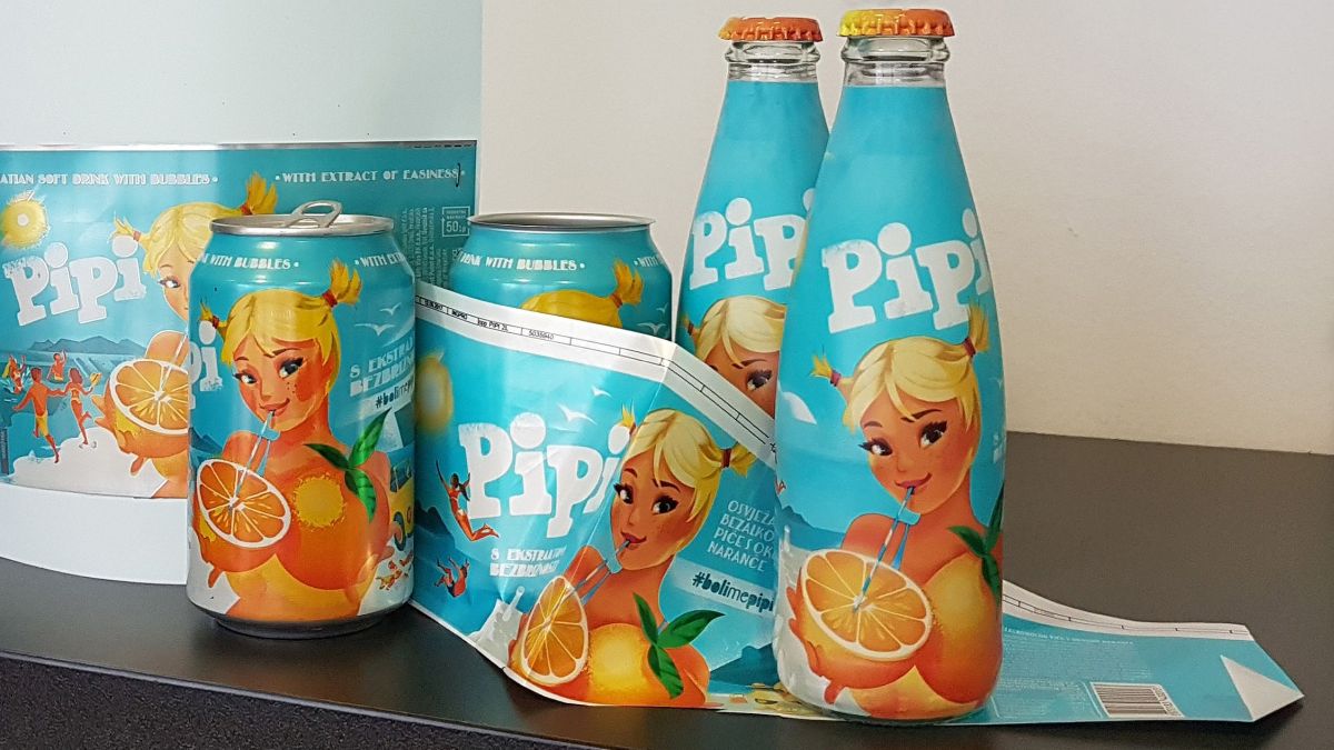
Pipi - standardised look for PET, glass and cans
Larger customers in particular are often faced with the task of transferring an existing layout from one type of packaging to another. As in the case of „Pipi“, by its own account the best known Orange lemonade the city of Split, which was named after the rebellious girl from Astrid Lindgren's famous children's book. The Croatian customer wanted to expand its broad portfolio to include a 330-millilitre beverage can. Until now, Pipi manufacturer Dalmacijavino PET bottles with half, one and 1.5 litre capacities as well as a 250-millilitre glass bottle. Accordingly, the beverage manufacturer supplied the experts at Ball Beverage Packaging Labels of PET bottles and Sleeves for glass bottles as templates. The main challenge in this project was to adapt the design of the can exactly to the look of the existing product range, which had a plastic appearance due to the material.
„With our service, we give customers the opportunity to view their design on the can at the end of the process - always with the option of being able to change coatings, colours or even the pre-press stage immediately.“
Richard Bunney, Head of Graphics & Design at Ball
Once the transfer of the design had been completed, it was installed at Ball in the Repro department prepared for printing. In this phase of the process, the main aim is to prevent neighbouring printing inks from running into each other and mixing with the help of so-called air gaps. The challenge is to remain within the technical feasibility limits of the printing process in order to achieve a flawless print result. In the case of the lemonade can, the main focus was on perfectly reproducing the design while emphasising the bright orange of the fruit depicted.
Richard Bunney comments: „For this project, we wanted to work with our established CDI printing technology to the absolute limit. To achieve this, we opted for very opaque colours to imitate the plastic look of the original label as closely as possible. We supported this effect with a matt top coat and the result was absolutely convincing.“

Magic Rock - Art on cans
Ball Beverage Packaging is proud of the fact that many customers repeatedly use the company's service. This was also the case with the British craft beer brand „Magic Rock“, which was founded in 2011. Back in 2015, Ball helped them transfer their design from glass bottles to cans. A good three years later, Magic Rock revised its design and once again worked closely with Ball.
„There are so many beers today with a fantastic design. That's why it was time for us to create a slightly more daring look that stands out even more.“
Richard Burhouse, founder of Magic Rock
The new designs are a bold mix of colours and shapes and make the cans look like little works of art. To achieve such flawless results, not only do the design and pre-press have to be right, but the third step is also crucial: the test print. This gives all customers the opportunity to check the colours again and make any final changes before the final production of the cans begins.
[infotext icon]You can gain an insight into the complete product portfolio of Ball Beverage Packaging Europe at the Company homepage.
[/infotext]