November 2025
The world of packaging is constantly on the move, with brands and companies looking for new, innovative solutions. Material reduction is an issue here, because sustainability is and remains important. bpc Berndt+Partner Creality is on the lookout for innovative ideas. Every month, we present the Packaging of the Month in co-operation.
A can that rethinks wine
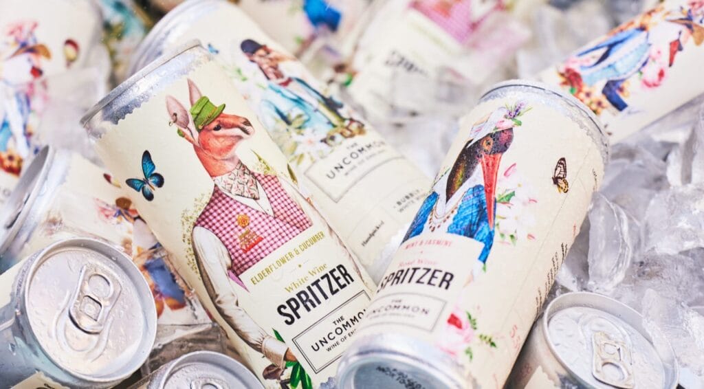
British brand The Uncommon is bringing wine into a can format - and revitalising a classic. With a matt printed aluminium container, decorated with a filigree illustration in Victorian style - a bird in a frock coat, with floral details - a visual combination of tradition and contemporary design is achieved. The design stands out well on the shelf and gives the tinned wine format a classy look.
Modern format meets nostalgic aesthetics
The decision to offer wine in cans rather than the classic bottle is part of a larger trend: convenience, portability and appealing to younger target groups. According to the brand, a format was deliberately chosen that is „unexpectedly English, unbelievably good“. The packaging itself - with its matt surface and playful design - conveys premium quality and differentiation from conventional wine bottles.
Content and packaging in harmony
The can combines visual distinctiveness with functional lightness: a can is handy, easy to transport and opens up the wine segment for new places of use - from picnics to urban rooftop bars. At the same time, the illustration is based on British style references and creates an emotional connection that appeals to consumers. According to an interview with the founders, the design was so important that „99 % of people talk about the branding before they talk about the wine“.
Significance for packaging development
An interesting case can be derived here for packaging and branding experts: Firstly, it shows how an established beverage segment (wine) can be rethought using an alternative packaging material (can). Secondly, it is about how brand identity is conveyed through design and choice of material - matt finish instead of high gloss, illustration instead of minimalism. Thirdly, it is an example of how packaging works in its function as a brand ambassador - not just as a shell, but as an experience.
Conclusion
The Uncommon is a successful combination of British wine tradition and contemporary packaging culture. The can becomes a stage for brand worlds and design standards - and shows that packaging is more than just functional protection. In this sense, The Uncommon is our „Packaging of the Month“ - a statement on how clever packaging can reposition a product.
As a packaging design agency bpc Berndt+Partner Creality for holistic packaging design, branding and product innovation. With its designers, engineers, concept developers, developers, market researchers, strategists and idea suppliers, the agency operates worldwide and has more than 20 years of experience and 1,000 projects under its belt. >>> bpc.works

