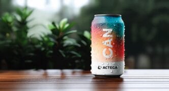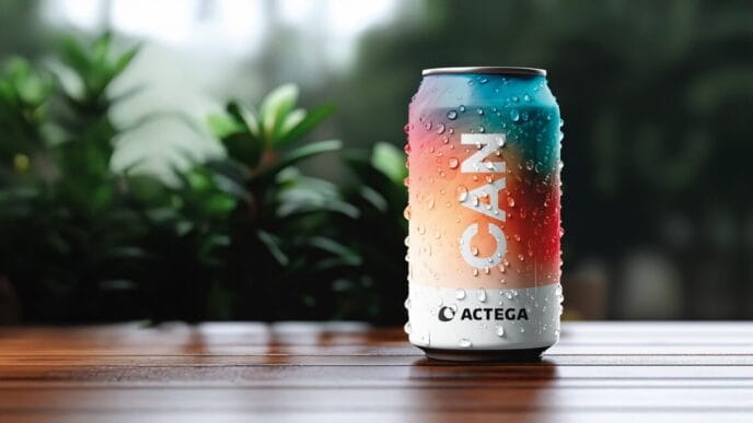


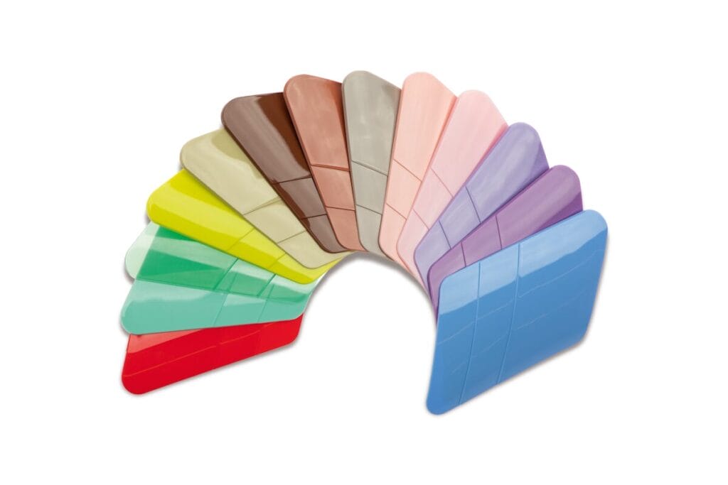
With the „Shades of Beauty & Care 2027“, masterbatch manufacturer Lifocolor is presenting 36 new colour shades that translate the desire for clarity, self-care and emotional connection into design. The trend collection ties in with social developments and offers brands new opportunities for positioning themselves.
With its current trend colour edition „Shades of Beauty & Care 2027“, the Lifocolor Group has presented a collection that picks up on current social developments in packaging design for cosmetics and care products. Under the guiding theme The Human Re:Set focuses on emotional worlds of colour that reflect a new understanding of beauty, retreat and identity.
 Colour as an expression of social moods
In the face of technological upheaval, growing complexity and social tensions, many people are longing for reduction, meaning and emotional stability. According to Lifocolor, this attitude is increasingly reflected in the design of products. Packaging should not only be functional, but also meaningful and aesthetically appealing - especially in the beauty and care sector.

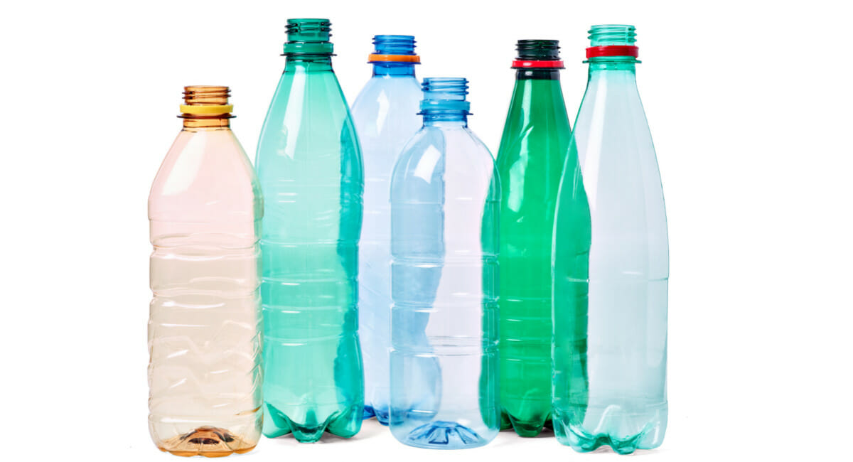
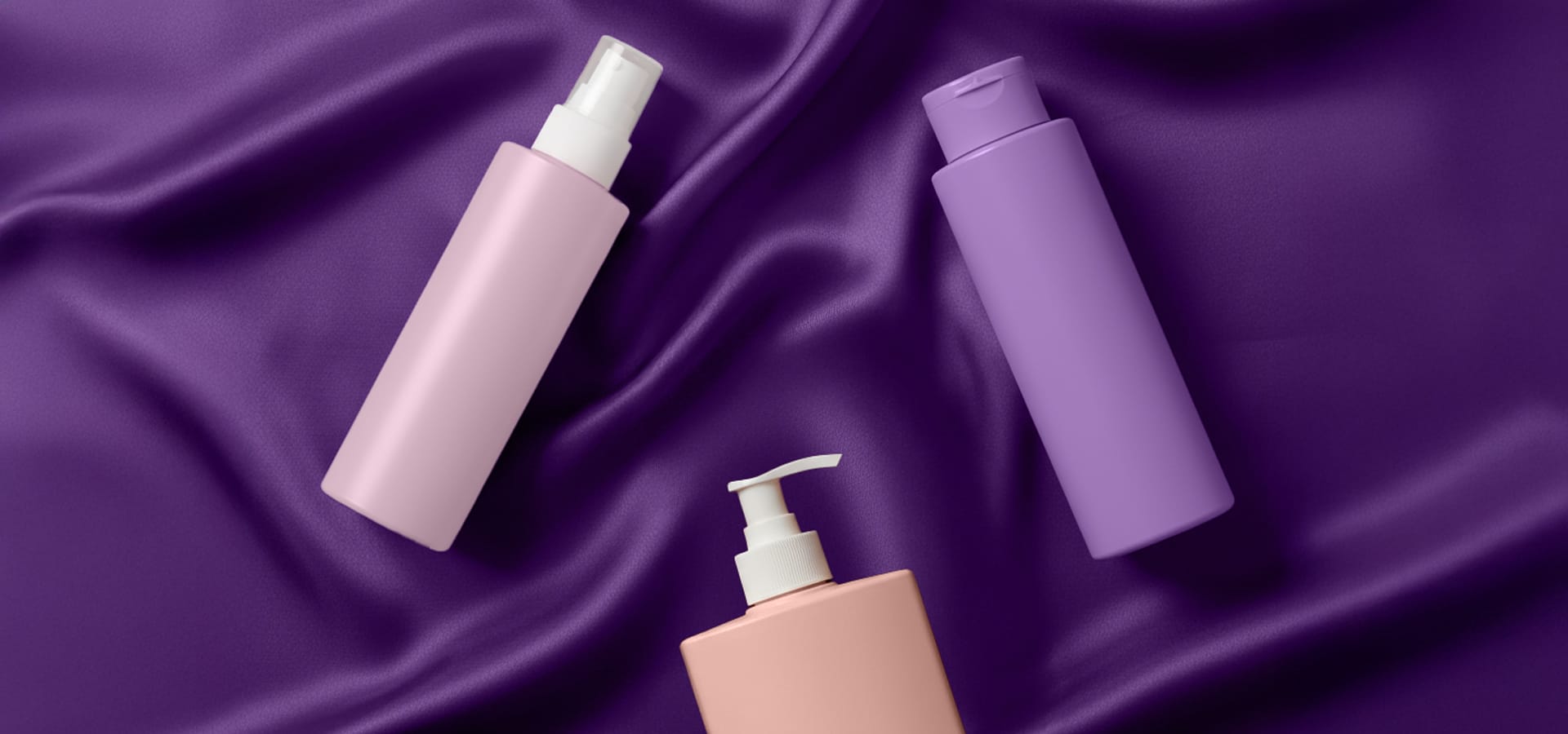
The 36 new colours reflect this development. Warm, natural and multi-layered colours replace visual sensory overload. Berry, coral and brown tones convey grounding and depth, while delicate rosé and mauve nuances suggest intimacy and value. Neutral shades in off-white, grey or beige stand for clarity, while lively green and yellow tones underline the desire for regeneration. Blue only appears - if at all - in a reduced, aquatic form. .
Four colour worlds for different brand messages
The „Shades of Beauty & Care 2027“ edition is divided into four themed areas:
Radiant Rebels stands for expressive design with strong red, orange and yellow tones, contrasted by black and white elements. This world of colour is aimed at presence, self-presentation and a strong emotional impact.
Structured Ease takes a more restrained approach. Clear, modern colours convey calm and order and are based on minimalist design.
Cultural Weave combines earthy and natural tones with cultural depth. This world of colour is aimed at brands with values such as reliability, origin and authenticity.
Velvet Tomorrow includes pastel, soft tones that symbolise closeness, care and sensitive consumption.
 Applications in packaging design
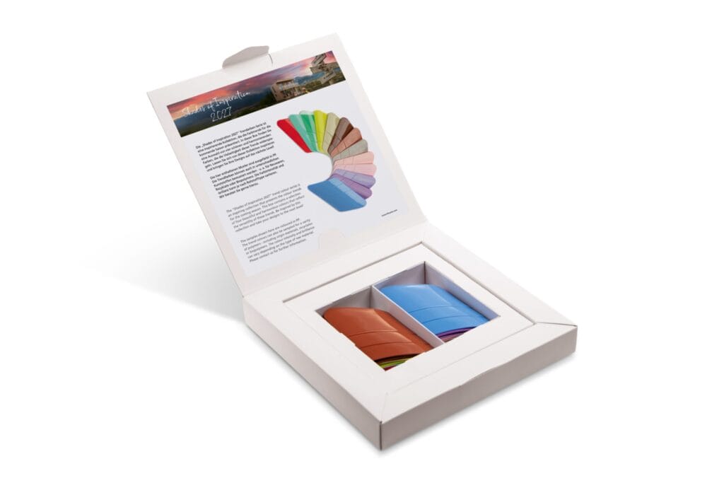
Lifocolor provides brands and packaging developers with the new colour edition in the form of flyers, colour fans and sample boxes with examples in PE, PP and PET. According to the company, the colours are not only intended to appeal aesthetically, but also to be used strategically to convey brand messages and address consumer needs more specifically. Lifocolor emphasises the importance of colour selection as part of a holistic product experience.
Source: Lifocolor