


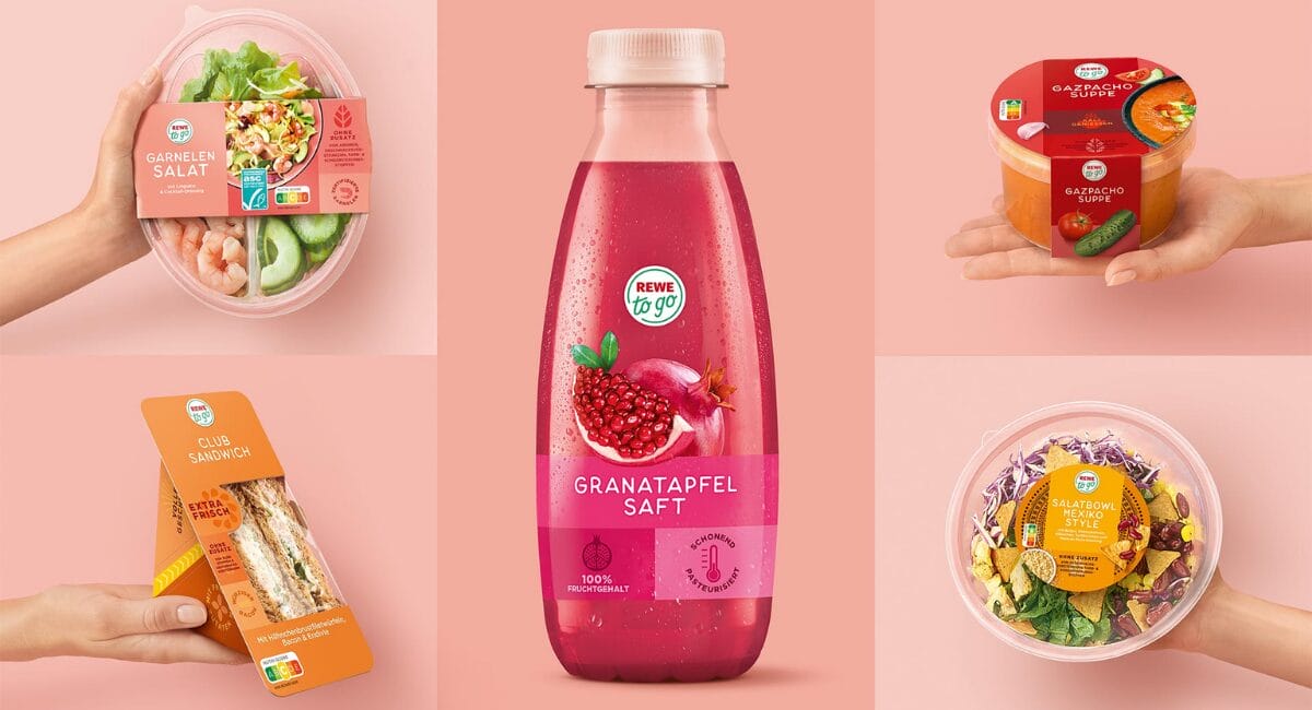
The Hamburg agency Hajok Design has designed the brand relaunch of Rewe to go. The convenience brand presents itself in a new look with a strong brand presence.
In order to further raise the profile of the Rewe to go brand and strengthen its market position, the The visual identity has now been comprehensively revised. The Hamburg agency Hajok Design is responsible for the design as a long-standing creative partner.
The Rewe to go products in the new design have been continuously replacing the old packaging since 2024. The brand values of Rewe to go are now even more clearly in focus. A clear structure, modern colours and a modular system create orientation and lend an unmistakable presence. The logo in the centre acts as a guarantee of quality. Individual benefit icons and eye-catching food presentations emphasise the lifestyle character of the brand.

„With the relaunch, Rewe to go has taken the next important step in the convenience segment and is also sending a clear signal to entry-level food retail concepts. The modern and contemporary design puts the brand values centre stage. Together with Hajok Design, we have developed a strong creative concept for the reorientation - an exciting process that has paid off for us and the brand.“
Nora Böhm, Senior Product Manager REWE Group

Stefan Heydecke, Design Director at Hajok Design, also emphasises the strategic dimension: „The new visual system combines brand strength with flexibility. It makes the Values of Rewe to go visible on the shelf and creates a consistent presence across all product categories.“
The relaunch includes over 90 articles, including snacks, protein-rich meals and vegan ready meals. As a full-service agency, Hajok Design was not only responsible for developing the design but also for the realisation and final artwork creation. Photo shoots, illustrations and image editing were realised in-house and in close collaboration with the creative team.
Source: Hajok Design