


The research and consulting company SenseCatch applies neuroscience and behavioural psychology to marketing and the measurement of customer experience and has been commissioned by UPM Raflatac to investigate how label papers and finishes influence the perception of wine.
Marketing experts agree that the Wine label design a key factor in the decision-making process of the consumer. Assuming that shoppers spend an average of 15 seconds looking at the wine on the shelf, the label design must stand out visually and immediately attract the consumer's attention. It must therefore be designed in such a way that itThe desire to take the bottle in your hand.
From this moment the sense of touch comes into playNeuroscientific studies have shown that tactile information is processed in the brain by creating a visual representation of a texture, thus creating accurate expectations. If a label is beautiful to look at but not attractive to touch, it creates a feeling of incongruity that can lead to a product not being purchased.

Neuromarketing makes it possible to understand the actual decision-making mechanisms because it uses techniques that a scientific approach to unconscious levels make this possible. The most important tool is the eye tracker, which can be used to analyse people's attention and visual behaviour with absolute precision. There are also other technologies and software such as the Face Reader, which maps facial micro-expressions and helps to understand what kind of emotion is being felt.
Understanding the consumer journey
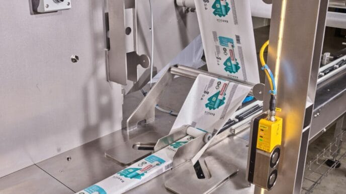
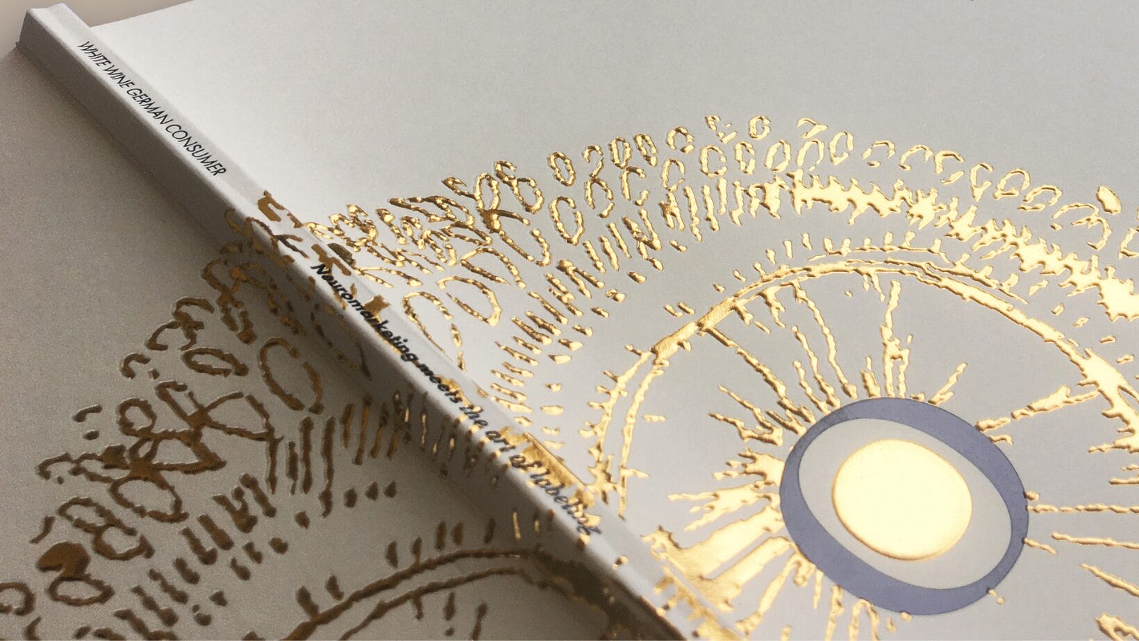
For the study 32 labels of the same shape and size were produced, combining six paper grades from UPM Raflatac and five finishes from Kurz. The labels had the same graphic design and contained the same information, but differed in terms of paper properties (colour tone, mattness, thickness, roughness and feel) and finishing (colour, thickness, relief - embossing/debossing - and gloss). The labels were produced by Krämer Druck industrially printed under real conditions, so that they looked exactly like the bottles on the shelves. The entire „consumer journey“ was retraced, from viewing the shelf and selecting the wine to tasting the product.
The test group consisted of 30 German white wine-drinking consumers aged between 25 and 56. In front of the shelf Labels made of dark paper with a metallic, shiny, silver or gold-coloured finish or made of light paper with a bronze-coloured finish attracted the most attention. The same applied to labels made of rough paper, with a visible texture and relief embossing with a glossy effect, which aroused expectations of an interesting feel just by looking at them. When the test subjects were able to look at and touch the bottles individually, they took the white wines with white labels and a haptic dimension The embossing or cotton paper as well as shiny decorations in gold or bronze colour are perceived as particularly high quality.
The results of the study have Interaction between the senses of sight and touch and the function of the label The use of dark colours is proven - not only in terms of a purchase decision, but also when it comes to creating the consumer's perception of the tasting experience. Dark colours are perceived as high-quality and elegant, but are associated with a strong wine, which is why they are more suitable for red wine, especially in combination with a rough and matt paper. Conclusion: The label sells the first bottle, the producer sells all the others.