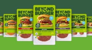
GEA also wants to be more present in the minds of end consumers and has therefore given itself a new brand image. The logo and design language have been refreshed worldwide and are intended to emphasise the company's sustainability. The new design was accompanied by Mutabor.
A new image film of the company was also released. The The changeover to the refreshed corporate design took place at the beginning of March as part of the annual press conference. At the same time, the digital external and internal touchpoints such as the company website, social media channels and intranet went live. The annual report and sustainability report were also published in a new look.
All-round new brand image
The logo essentially stands for the quality of the brand GEA. It was refreshed primarily to optimise the improve the digital presentation and make it more dynamic. The new colour scheme stands out with its high-contrast colours. These symbolise the moment the day begins, because every day is an opportunity to improve.
Icons are an integral part of communication today and therefore also play an important role at GEA, especially in digital applications. One feature is the open contour, the so-called „nibble corner“, which gives the GEA icons a recognisable value.
The brand presence is supported by a new typeface complemented. GEA Sans is characterised by a bold technical look, which is derived from the further developed logo and a strong reference to technology.
„The new GEA brand experience conveys our Sustainability DNA and technology leadership in an emotional way. We want to appear approachable and trustworthy, remain true to our brand essence - Engineering for a better world - and create a strong identification with GEA.“
Jill Meiburg, SVP Group Communications and Brand
Source: GEA
More news on the topic of design


Old Bay returns to the classic tin can

Bel starts worldwide changeover to paper packaging

Packaging Of The Month - A can that rethinks wine

Beverage carton recycling becomes a fashion statement

