


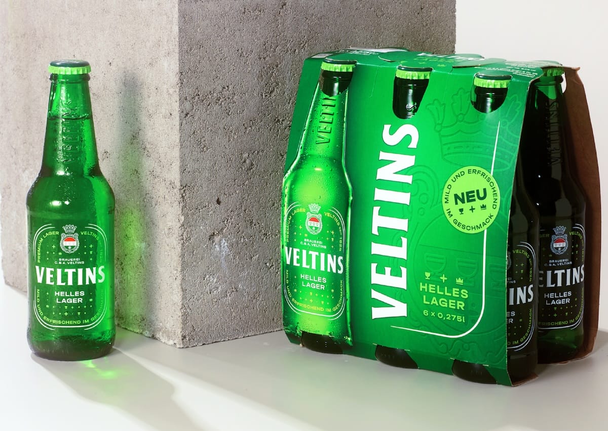
The Veltins brewery is expanding its range to include a pale lager and has commissioned the design agency Mutabor to develop a modern packaging design. With a green returnable bottle and innovative design elements, the new Veltins Helles Lager appeals to a younger target group in particular.
The new packaging for Helle Lager features a green returnable bottle with a branded label instead of a printed label. According to Veltins, this is a deliberate design choice to create a modern, international look. The smaller container format, which stands out from the usual German beer bottles, is particularly striking. The design of the packaging, including crown caps, returnable crates and six-pack carriers, was completely taken over by Mutabor.
A modern but brand-loyal design

Stefan Wiesmann, Marketing Director at Veltins, emphasises that the Helle Lager represents an important step in the further development of the product portfolio. Mutabor is a long-standing partner that has already supported the Veltins brand in previous projects. The aim was to create a clear differentiation from the classic pilsner without losing the brand identity. This is reflected in the colour scheme: a light green, which stands for the freshness of the beer, and a heightened white space, which emphasises the mildness of the pale lager.
Personalised packaging by Mutabor
The design agency Mutabor, which specialises in holistic branding and packaging, put together an interdisciplinary team of designers, strategists and content experts for this project. According to the company, it is important that packaging is not only functional, but also emotionally appealing and conveys the brand story. Moritz Carstens, Creative Director at Mutabor, explained that the redesign of the Veltins packaging was about a modern interpretation of the classic brand features. The challenge was to both preserve the brand's tradition and set new accents for a younger target group.
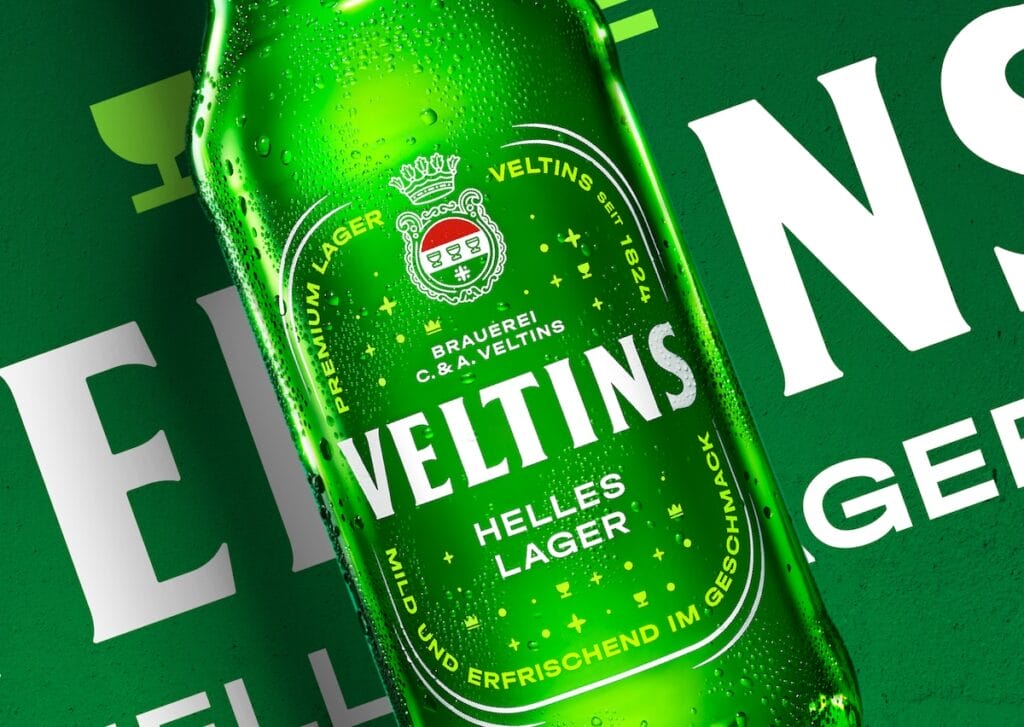
Flexible font system and purist icons
Special attention was paid to the typography: the new flexible font system reinterprets the classic Veltins font and gives the packaging a modern touch. In addition, icons were derived from the brand coat of arms, depicting the chalice, crown and star in a younger, more purist form. These symbols contribute to the rejuvenation of the brand and are an integral part of the new design strategy.
Focus on sustainability
When it comes to sustainability, Veltins is also focussing on contemporary solutions for Hellen Lager. The bottles are made of polyethylene (PE) and can have a post-consumer recycled content (PCR) of up to 50 % on request. In addition, a five-layer version with an EVOH barrier is offered to ensure the protection of the beer formulation. This is in line with the company's statement that it is responding to the increased demand for environmentally friendly packaging solutions.
Source: Mutabor