


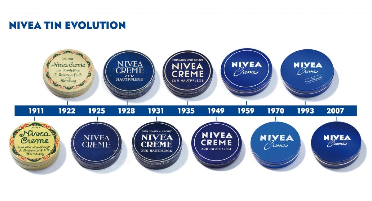
Some packaging disappears as quickly as trends appear. And there is the blue Nivea Creme tin. It has borne its deep blue colour, white lettering and round shape since 1925 - a design that has remained stable over generations, markets and crises and is now celebrating its 100th birthday.
At a time when brands are constantly being „refreshed“, the can seems almost defiantly timeless - and is therefore an exciting object of study for anyone who packages products, builds machines or develops materials.
In 1925, Beiersdorf took the radical step away from a yellow, floral Art Nouveau tin to a clear, maritime-inspired appearance: deep blue, reduced typography, no ornaments. The content remained the same, the message changed completely - decor became brand identity. Blue and white were intended to signal reliability, purity and closeness; colours that still characterise the entire Nivea branding today and made the jar the blueprint for the corporate design. Many years later, designers such as Yves Béhar took up precisely this round, blue motif to formally dock the entire Nivea packaging world to the jar - from the bottle shoulder radius to the embossed lid.

Packaging as a brand icon
In terms of packaging practice, there is a simple but consistently well thought-out idea: the primary packaging as a brand icon, not as an interchangeable shell. The Nivea tin is simultaneously a container, logo and brand symbol - it is so strong that it can even serve as a graphic element for campaigns, limited editions and pop-up experiences. While new shapes and refinements are constantly fighting for attention on the cosmetics shelf, Nivea relies on recognisability and rituals with the tin: the round, flat metal jar fits in the hand, in the toiletry bag, on the edge of the bathroom - and tells the same story everywhere.
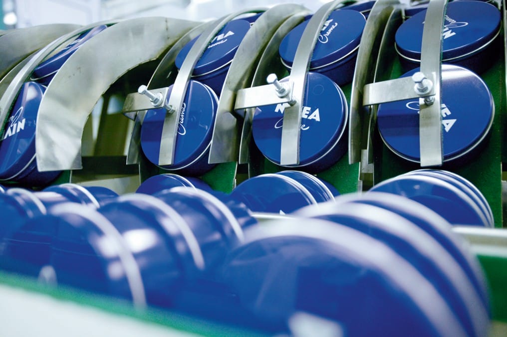
In technical terms, the can is also an interesting lesson. The aluminium jar - now with a recycled content of at least 80 percent - shows that iconic design and modern sustainability requirements do not have to be mutually exclusive. Instead of sacrificing the shape, the material formulation, wall thicknesses, recyclability and production were fine-tuned. The cans are manufactured at the Hamburg plant and used in over 170 markets worldwide; local filling meets globally standardised packaging - a logistical balancing act that is particularly exciting for machine and material manufacturers.
For packaging developers, plant manufacturers and material suppliers, there are several lessons to be learnt from this: Firstly, it is worth investing in a clear, long-lasting design language instead of changing the silhouette every season. Secondly, the blue can shows how strongly a single iconic pack can fertilise an entire brand architecture - from the tube to the airless dispenser. And thirdly, it proves that even supposedly „finished“ classics still offer scope for technical innovation: less material used, higher recycled content, more efficient processes - without jeopardising recognition value.
One hundred years after its introduction, Beiersdorf claims to sell more than four blue cans per second worldwide. For consumers, it is often a piece of childhood, for designers a textbook example, for the industry a benchmark for what consistently good packaging can look like. In times when regulatory pressure, sustainability targets and cost efficiency determine development, the Nivea can is a reminder that a strong, consistent shape is sometimes the most robust thing a brand can have - and that good packaging not only outlasts products, but also decades.