Crown Europe, manufacturer of metal packaging, is presenting a new metal can designed to appeal to environmentally conscious consumers in particular. The basis for the design was a current trend analysis for the development of new products.
For brands using metal packaging, colours, decorative finishes and textures play a key role in attracting consumers. This fact makes it crucial for brands to understand what their Target groups influenced and motivated, both now and in the future. Crown Europe has recently signed Colour and material designer and trend forecaster Laura Perryman worked together to find out, how future trends will drive innovation in their portfolio can influence.
The design experts at Crown have used the findings as a Inspiration for new packaging concepts that can help brand owners deliver exciting new products that resonate with consumers.

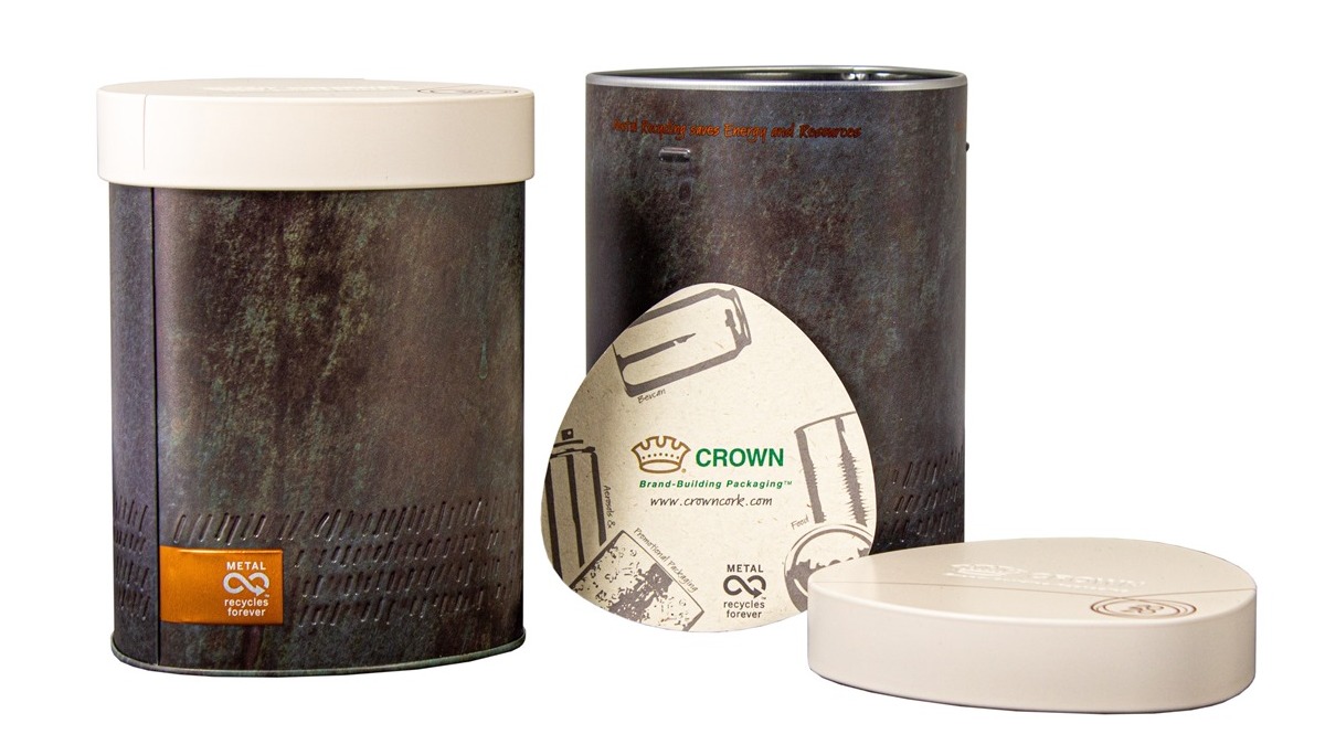
„Authentic“ metal tin
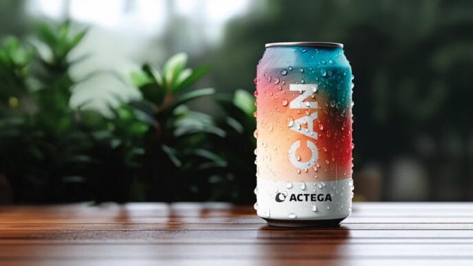
The first result of the trend analysis is a new promotional packaging or gift tin that reflects the „Human Nature“ trend picks up. Time slows down in what Perryman describes as a authentic trend The trend has been labelled the "can", which focuses on the beauty of differences within the environmental landscape, where people keep an eye on nature and respect the natural flow of its processes. Based on this trend, the concept of the can was developed to appeal to consumers who want to buy goods that are more environmentally friendly.
The printing colours of the gift tin create a oxidised mineral effect, which gives the appearance of natural weathering over time and draws on a colour palette that embraces the diversity of nature. The lower part of the body of the packaging has been Embossing effects added, giving a hand-carved appearance reminiscent of the raw tactility aspect of the Human Nature trend. The contrasting lid, which looks like Stone and has a matt texture, shows how metal can support opaque designs.
High recognition value
The triangular design and the rounded edges of the packaging ensure a High degree of differentiation on the shelf. In addition to its eye-catching design, the can is easier to grip - a direct result of the fact that Crown's designers have focussed on ergonomics in every project.
„It was a really interesting task to design this unique can based on our recent research project on colour trends. The can is a great example of how we can utilise our extensive research to create tangible products and ensure brand owners have the tools they need to target specific demographics,“ explained Sarah D'Amato, NPD and Marketing Manager at Crown Aerosols & Promotional Packaging.
Source: Crown Europe