


New food = new design? EU amendment 171 wants to ban allusions to milk in plant-based milk alternatives. At the same time, consumers in the supermarket are guided by design codes that they recognise from animal products. Brands therefore need to break these habits and create a new balance between the familiar and the unexpected with innovative design solutions.
What we today call Brand codes of food stamps were already known to our ancestors: The bright colours, the delicious smell and the feel of fruits and berries gave us clues as to whether they were ripe. Similar rules apply in the supermarket, and people make their selection according to many different criteria. natural codes. At the same time, they orientate themselves towards systems that the industry has established. When looking for milk, consumers look for the name „milk“, for images of cows, meadows, the Colours white, blue and green. And every child knows that milk often comes in a carton anyway. Where it is, too. You can trust that blindly. The information we have learnt guides us through the shelves as safely as Google Maps guides us through cities.

Consumers take a similar approach when looking for a milk substitute. For now! They have become accustomed to the fact that oat drinks do not contain milk and therefore cannot be labelled as „milk“. EU amendment 171 now goes one step further: it wants to ban any „imitation or allusion“ to milk. This means that not the slightest association with the animal product arise. This also includes labelling such as „no milk“ and „milk alternative“. There are also great fears that even images of white drinks in a glass or the carton will come under scrutiny.

Packaging design for milk substitute products: Determined to shape new codes
New regulations are always taking a swipe at the development of plant-based foods. If you take a closer look, they can be not only a hurdle but also an opportunity. Because the fact is that manufacturers of plant-based products have to dig deep into their bag of tricks to position themselves successfully. There are currently so many new products on our shelves that it is becoming increasingly difficult for consumers to find the right one quickly. Some brands have recognised this and have developed a Balance between learnt and unexpected design codes and set new standards for the industry.
It says more than it contains
How do you make it clear on the product what consumers can expect from it? You might write „oat drink“ on a plant-based drink. More conservative, price-orientated consumers are looking for exactly that.

For those who want to buy food choose according to their lifestyle and expect something radically new, something more is needed. Brand names Oatly„ and “Nilk„ immediately catch the eye, especially because they know how to deal creatively with strict regulations.

In addition to the product name, brands may also use the Effect of secondary texts should not be underestimated. Consumers simply don't have the nerve for a flood of information without an atmosphere. If they are entertained, reading time becomes quality time. The tone of voice makes all the difference. Oatly's secondary texts, for example, are one of the brand's greatest unique selling points. Their back-of-pack texts are edgy and entertaining - they engage and motivate.

The Innocent brand is the perfect example of how brands can Strongly rooted in lifestyle topics Innocent addresses the core needs of a large part of society: feeling good about your choice, doing good and being positive. The clever thing is that the brand is not strictly limited to fruit juices and its attitude can be applied to any plant-based drink. So nobody will ask whether the smoothie manufacturer can also make milk substitutes. Both categories feel right with Innocent.

Bold graphic elements meet unexpected colours
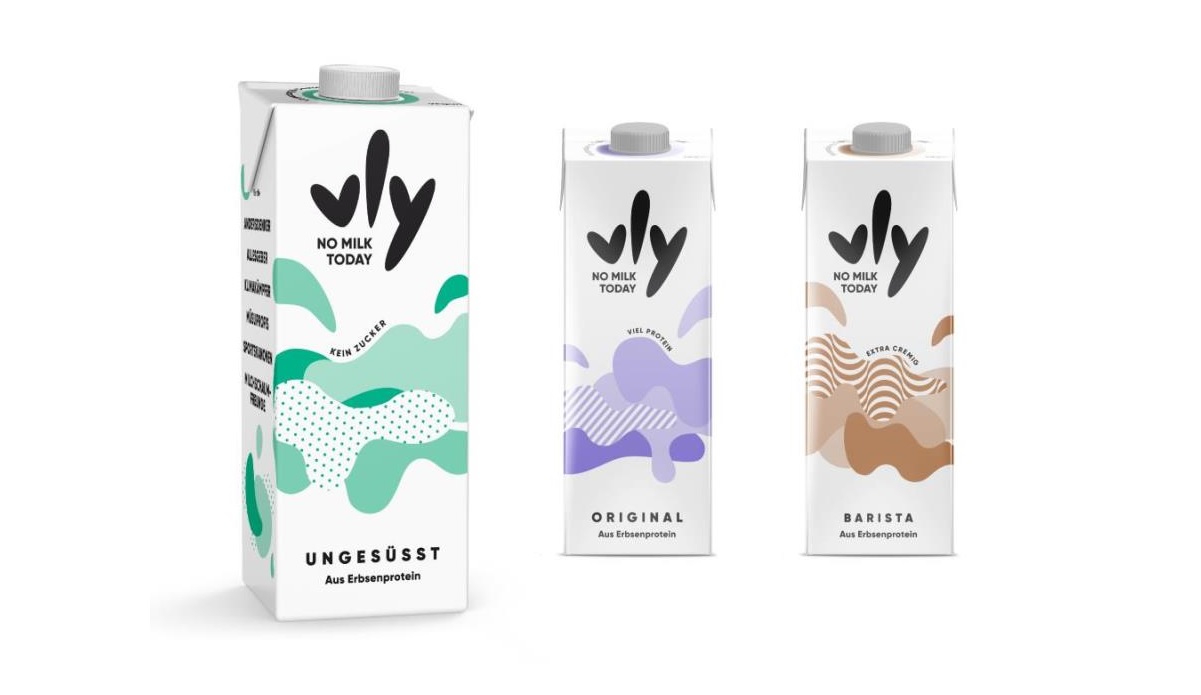
Some brands are already quite expressive in terms of the variety of graphics and colours on their packaging. Instead of just depicting the product, visualise its applicationThe result: it's in your coffee cup or in your muesli - as you can see with Lidl's own brand Vemondo, for example. Vly goes even further. In conjunction with the name, the design almost evokes associations with an app. The colours are also more at home in the digital world.

White is still very present and effectively describes the product as a milk alternative. This learned colour code is also quite important in order not to completely lose touch with consumers. And if the visualisation is struggling to look like a food product - don't worry! It might be confusing for some consumers. But it is exactly the right solution for pioneers who are looking for a cool alternative long for.
Breaking with standards can give brands an advantage
In recent decades, cartons have become the standard for milk in many markets for cost reasons. Due to Independent packaging forms and Innovative materials milk substitute drinks would therefore gain enormous attention. It is true that the use of non-standardised packaging is complex and cost-intensive. However, in Germany in particular, there are huge opportunities for using moulds and materials to unmistakable to become.
Milk is already leading the way in some areas. The traditional brand Hemme Milch, for example, relies on a resealable milk bag with handle - in primary Black. That stands out.

The same can be said of the material: the forty per cent chalk content in the plastic makes the pack stable and reduces energy consumption during its production. Compared to cardboard, the bag also means 60 per cent less waste.
Staying with the topic of „sustainable packaging“, milk brands are generally doing more. For example, disposable glass bottles are gradually being replaced by Returnable bottles replaced. Or they are Refill stations set up. This protects the environment. This is a socially highly relevant area in which plant-based drinks are positioning themselves. It would therefore only be logical to overtake milk-based products with sustainable packaging solutions - and Plant-based products in plant-based packaging to offer. Like the US Danone brand „So Delicious Dairy Free“, for example: 80 per cent of the plastic in its bottles is made from sugar cane. The packaging is a logical consequence of the brand's attitude and makes the brand more visible.
And that's ultimately what it's all about: making plant-based drinks more relevant. This requires More courage in packaging design - even without amendment 171.

This guest article on the Packaging design for milk substitute products has Daniele Gasparini, Design Director at the Peter Schmidt Group written.
[infotext icon]Partner for positive change. This is what the brand and design agency founded in 1972 Peter Schmidt Group on the flag. With success: from five locations, it looks after major brands such as Deutsche Bahn and Mercedes-Benz - s10ie has just been selected by Beiersdorf as the global lead design agency for the Nivea brand[/infotext].