


THE PACKAGING USER
Character bumps: Irony in the luxury segment
I tend to display embarrassing behaviour (such as starting a text with „I“) or follow role models who are questionable. Like Hank Moody, for example, that walking contradiction from Californication. He is a writer, hedonist and self-sabotage on two legs. One morning, his black Porsche is parked like a beaten-up predator - the left front light smashed in by a cuckolded husband. Happens to Hank all the time. It's also normal that Moody never repairs the lights. What's more, when he gets a new Porsche a long time later, he smashes the light again himself. Same place, same damage. Why? I asked myself the same question. And then it dawned on me: because perfection simply doesn't suit him. Because a flawless luxury object would undermine his own image.
This is not an isolated case, but a principle. Luxury that is too slick quickly comes across as a false friend. Too polished means: not genuine. Too shiny means: not lived. That's why some things have an interest in looking bad - or at least less good than they could. As if to say: don't rely on appearances. And: don't take us too seriously.

John Lennon also understood this. His Rolls-Royce Phantom V - the epitome of British state car etiquette - was unceremoniously painted with flowers. Not an understatement, but a calculated affront. The Rolls was still expensive, still heavy, still a symbol of wealth. But it suddenly looked like a travelling contradiction: upper class meets hippie, empire meets LSD. Luxury that ironises itself is harder to attack. And more interesting.
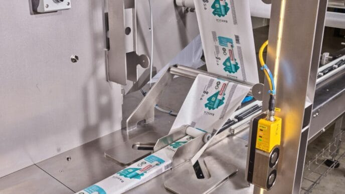
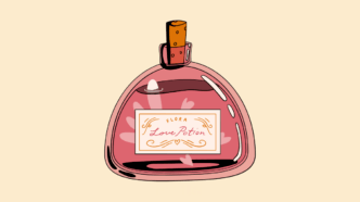
If you apply this to products and their packaging, you end up with a strange but very effective strategy: the deliberate image break. High-quality content, deliberately shabby packaging. Or at least one that counteracts the noble image. No velvet, no gold, no whisper of exclusivity. Instead, grey cardboard, sober typography, sometimes even a hint of official design. As if the product were saying: if you only love me because of my appearance, keep your hands off me.
In the premium segment in particular, this is almost a form of self-defence. Anyone who packs too luxuriously is quickly suspected of placing more emphasis on pose than on substance. The ironic break creates distance - and therefore credibility. An expensive wine in a label that looks like it came off a laser printer. High-priced cosmetics in tubes reminiscent of hospital supplies. Electronics in a box that looks more like a spare part than a lifestyle item. All of this undermines expectations. And that is precisely where the appeal lies.
The effect is twofold: the packaging protects the outside. It deters those who are only looking for prestige. On the inside, it ennobles the product. Because those who pick it up do so consciously - not because of the glamour, but despite the sobriety. Or precisely because of it. As with Hank Moody's Porsche, the flaw is not a flaw, but a statement: I am more than my appearance. I can take it.
Perhaps this is the most elegant form of irony in the consumer age: luxury that sabotages itself in order to stay true to itself. Packaging that doesn't polish the image, but questions it. Not because they want to be cheap - but because they can afford it.
Which is unfortunately not the case with me and a Porsche. So I'll never find out whether I would be as consistent as my hero Hank Moody if the worst came to the worst. Damn.
Harald Brown is not a packaging developer, a marketing strategist or a recycling professional - he is Packaging users. Nothing more and nothing less. And that is precisely what makes his perspective so valuable: unembellished, direct and full of everyday observations.
In his column "Let's wrap it up" he describes very personal experiences with boxes, foils, lids and everything that wraps products. Sometimes wonderfully funny, sometimes with a subtle side-swipe, always from the perspective of a consumer.
Anyone who produces, designs or sells packaging gets a refreshing view from the outside - and in the best case a smile.