Student develops corporate design for organic oat drink Gutsch
The budding designer Sara Dietrich developed the corporate design for a new oat drink line for two Swiss restaurateurs, which is to be launched this year and sold in Swiss cafés.
5 November 2021
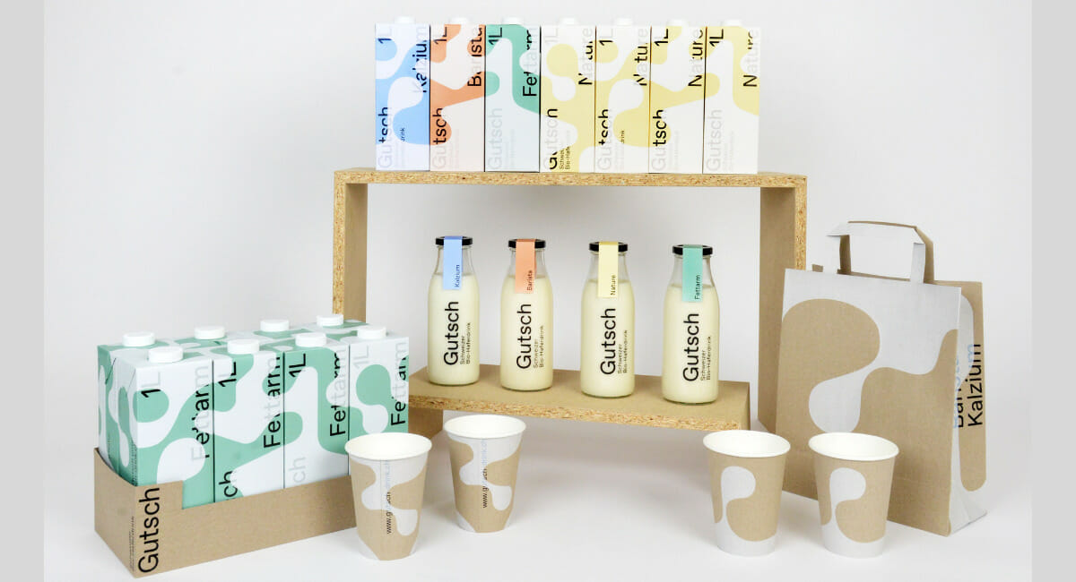
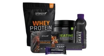
Corporate design for the new Swiss organic oat drink Gutsch. (Image: Sara Dietrich)
Budding designer Sara Dietrich worked on a real-life assignment for her bachelor's thesis. She developed the corporate design for a new oat drink line for two Swiss restaurateurs, which is to be launched this year and sold in Swiss cafés.
The two café operators Mathias Bühler from Bern and Philipp Schallberger from Basel produce one of the first organic oat milk products made from Swiss raw materials. For the development of the corporate design, they turned to the Lucerne School of Art and Design. „The assignment found its way to me via the head of the Graphic Design degree programme, so I started the practical work for my bachelor's thesis in March,“ says Sara Dietrich. It was about not only about the packaging design; other media such as flyers, posters, carrier bags, coffee mugs and a website were developed.
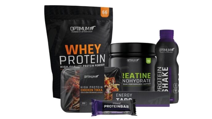
(Image: Sara Dietrich)
A good morning
From the outset, the design student worked with the two café operators and initially created a brand profile in which they set out the cornerstones of the brand positioning. As independent entrepreneurs in the local coffee scene, the two restaurateurs want to our own community with products in Swiss organic quality supply. Credit, the brand name of the new organic oat drink, is intended to convey regionality and „Swissness“: In Switzerland, a gutsch is known as a small sip of liquid - for example, a gutsch of milk that you pour into your coffee. The new organic product is to be served in Swiss-German cafés and coffee roasters, where it will also be sold to private consumers. It will not be available in the large supermarket chains.
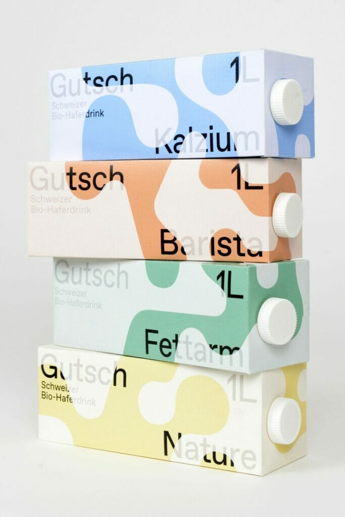
The final design shows Generous graphic shapes, which are present throughout the corporate design.
Display
(Image: Sara Dietrich)
„As a reduced, free interpretation of the Gutsch, I placed the transparent form over the font and colour level of the various media. In combination with the ‘ABC Favorit“ font and an independent colour scheme, the volume of the corporate design can be regulated across different media." Sara Dietrich, Designer
Four packages make one pattern
Each of the four types of drink appears in four different versions, with the mould rotating clockwise by 90 degrees around the packaging. This allows assemble the packaging into a pattern. As a sorting aid, there is a number on each packaging base that indicates the position of the respective packaging within the pattern.
„For the design of the bachelor's thesis, I took some liberties that have not (yet) been realised in the course of the project. I worked with four different types of drink, whereby Mathias and Philipp have currently developed a single recipe. However, depending on the success of the project and their capacities, they are open to expanding their product line in the future.“
Glass bottles are also unlikely to be implemented for the time being. „So that the use of glass bottles is sustainable at all, they must be reusable. However, there is currently no access to suitable cleaning facilities for the corresponding reusable solution, so the implementation of glass bottles makes little sense at the moment.“
Currently the first test production of the drink and some of the partner cafés are already serving the Gutsch. „In a second round, the recipe will be slightly adapted before the printing of the packaging I developed is commissioned.“ Then production can finally start.