


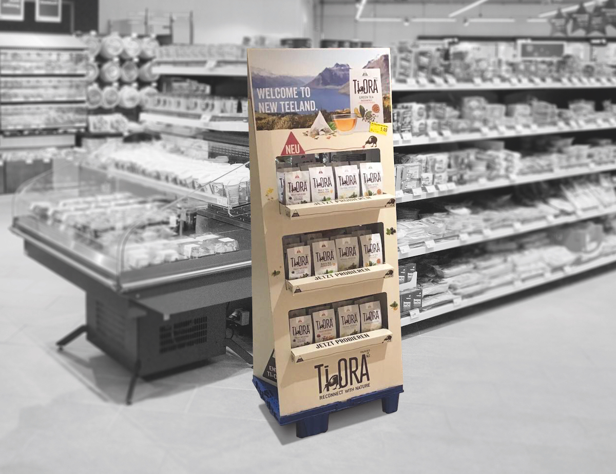
„Welcome to New Teeland!“ - With the launch of the New Zealand tea brand Ti Ora, Jacobs Douwe Egberts has been bringing a breath of fresh air to the tea shelf since the beginning of 2019. The original tea blends in pyramid bags focus on naturalness and ingredients from New Zealand.
On the pages published by the STI Group developed Displays for Germany, Great Britain and Spain, the kiwi is of course a must. The New Zealand's national symbol creates a direct link to the place of longing at the other end of the world. Aspects such as naturalness and sustainability characterise the young brand and are reflected in the POS appearance. The display, realised entirely in corrugated cardboard, impresses with a natural look that suits the target group.
„With Ti Ora, we are particularly targeting women between the ages of 20 and 49.“
„The theme of naturalness and social commitment play a major role here - this is reflected in the brand as well as the POS appearance.“,
Dorothea Beintken, Instore Activation Manager at JDE.
The new product can be found in the major supermarket chains.

For the launch campaign at the POS, the displays take the trapezoidal teabag shape on. This stands for the highest product quality, as it allows the tea flavours to develop very well.
„The unusual shape and the fact that it can be accessed from two sides ensures attention and sales,“ says Beintken, explaining the idea behind the display design. The product packaging also picks up on the trapezoid in the form of a bag.
Exceptional shelf stopper
On the shelf, a Shelf stopper to make customers aware of the new product: The trapezoidal sleeve is simply slipped between the tea packs, with the charming kiwi and the tea bag taking centre stage.
Source: STI Group