


Label manufacturer Vollherbst has realised the new design for the South African wine line Orpheus & The Raven using printing technology. The visual appearance and the filigree finishing technique have now been recognised with an award.
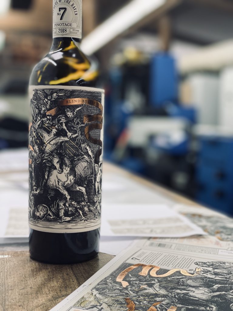
The design for the South African wine brand was created by Bravo Design from Cape Town and realised together with Full autumn at the Kaiserstuhl. Dramatic, hand-drawn sketches in the style of Albrecht Dürer are the trademark of the South African wine line Orpheus & The Raven. A wealth of detail and mysterious symbolism invite the viewer on a visual journey of discovery.
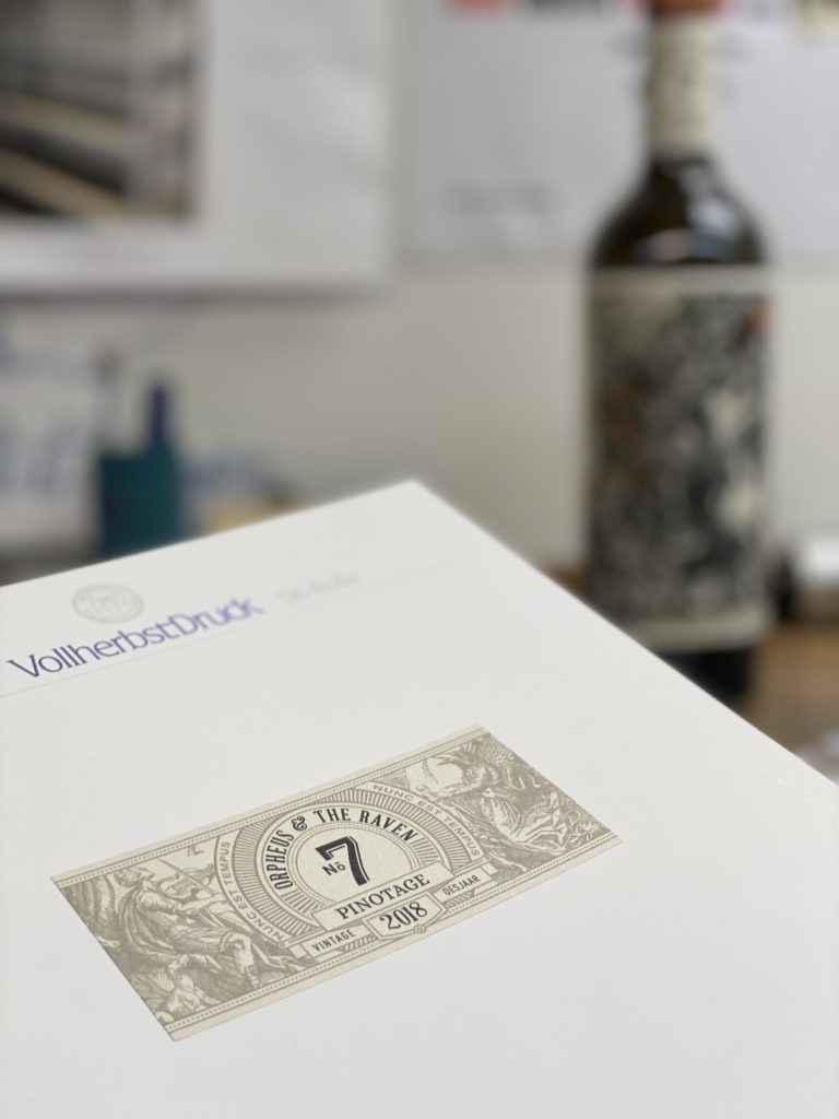
The complex technical printing realisation and production of the sophisticated graphic templates is the responsibility of the southern German label specialist Vollherbst. The labelling took second place in the „Best Design & Packaging“ category of the British magazine The Drinks Business.

Instead of conveying sober information about the wine, the brand tells the very personal story of the two initiators, winemaker Etienne Louw and designer Brenden Schwartz. The inspiration came from the Greek mythical figure Orpheus, who is not allowed to look back as he ascends from the underworld, but should always look ahead.
"Each of our labels is a unique work of art, which tells the story of how our brand was created. From concept to realisation. Just like the artistic transformation from grape to wine,” says Etienne Louw.
South African design with printing technology from Vollherbst
In the search for a print shop that could perfectly realise the sophisticated style in terms of printing technology, Vollherbst was found to be a suitable partner. Without the intensive collaboration between Orpheus & The Raven, the design specialists from Bravo and the finishing professionals from Endingen in Baden, the harmonious overall visual impression could hardly have been realised.
„The designer is not a printer and the printer is not a designer. Both have developed decisive ideas and found the best way together, to create an award-winning project. This only works if everyone is willing to share their knowledge,” says Brenden Schwartz, owner of the agency Bravo Design in Cape Town.
Realising the design authentically in print without overloading the label required an intelligent production concept and high precision in production. Vollherbst opted for offset printing to give the fine lines of the illustration maximum depth. This was followed by various shades of gold, applied in hot foil and again overprinted using the flexo process, to break up the dark background and create an interesting play of light.
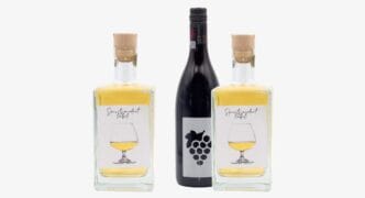
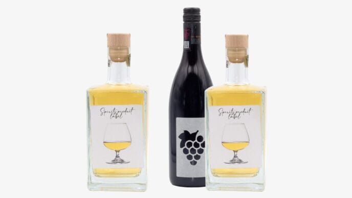
Orpheus & The Raven's labels challenge the buyer's eye and offer discoveries at second glance, such as traditional letterpress numbering that individualises each bottle. The basis for the visual experience is provided by a tactile natural paper, whose technology protects against moisture so that the aesthetics of the label are retained even in the fridge or ice bucket.
Source: Full autumn