For the first time in over 50 years of product history, Cornetto ice cream looks the same in all freezer counters around the world. With a major relaunch of the packaging design, Langnese wants to standardise the brand identities, which previously differed from region to region, and better emphasise the cool, crunchy product benefits of the waffle ice cream.
What a summer! Ice cream was one of Germans„ favourite sweets in the past hot months. This is indicated by data from the Federal Statistical Office. As reported by welt.de, German consumers have been spending record-breaking sums on this cool delicacy since April. According to the report, every German eats around eight litres of ice cream per year.
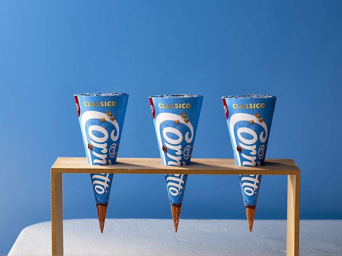
One of the best-known brands in refrigerated counters has long been „Cornetto“ from Langnese. Unnoticed by many, the appearance of the popular ice cream has changed. Newly designed packaging was delivered throughout Europe from 5 February and gradually found its way into freezer counters over the following months.


The same packaging all over the world
The new brand identity is a big step for Cornetto. For the first time in over 50 years of product history, Cornetto now looks the same all over the world.
Cornetto's presence in various local markets has so far been independent and sometimes inconsistent, explains Claire Robertshaw, Creative Director at the internationally active company. Brand design agency „Design Bridge“, which works for the Langnese parent company Unilever carried out the relaunch. The aim was to standardise and strengthen the brand identity globally. In addition, the previous design no longer met the current requirements of the Food marketing is sufficient. The new design is hoped to better reach the young target group.
")
The main changes for the „new“ Cornetto are the Packaging design and the logo. Everything was based on the motto „Making the moment“. The idea behind it: People should meet up to enjoy a cornetto together and create unforgettable moments.
To ensure that Cornetto is not just one of many ice creams in the chiller cabinet, the company's Relaunch The creative team entrusted with this task gave the packaging particularly bold colours. One striking example is packaging in a bright, optimistic sky blue colour. Other Cornettos are offered in intense red and bright yellow packaging. The agency generally used natural colours that correspond to the real ingredients. The previously used hyper-realistic renderings were dispensed with in favour of more natural-looking, real depictions of the ice cream cones.
Crunchy ice cream cone overlays the logo
The new design looks „pure, real and authentic“, says the German Langnese communications agency about the new Cornetto look. The positioning of the crunchy ice-cream cones is particularly successful. The brand focus here is on the motto „The perfect crunch“. Accordingly, an ice-cream cone with appetising wafer chips overlays the product logo on the outer packaging.
The logo itself also looks fresher and more modern. It now stretches across the entire width of the packaging. Compared to the previous version, it is particularly noticeable that the brown border around the individual letters has disappeared, as the specialist blog „Design Tagebuch“ notes. Design team creative director Mike Stride explains that the artificial-looking elements of the logo have been removed and it has been simplified overall. The „Creamy“, flowing appearance of the logo letters has been retained. The logo also still looks playful. By combining the lettering with the superimposed, real images of the Cornetto cones, the quality and natural ingredients of the traditional ice cream are emphasised.