Milliken & Company presents its ColorDirection 2021. Seven trend colours inspired by nature make up the ‚Harmonic Synergy‘ colour palette for the coming year.
People are visual beings, and Colour plays a key role in purchasing decisions. In the midst of the global challenges of 2020, cohesion is becoming an increasingly important trend for society and industry, which Milliken wants to reflect with the new colour palette. Therefore, the colours known as Harmonic Synergy colours that can be combined with each other in the overall picture a appealing flowing look the company says. And they are intended to provide inspiration for designers and a marketing roadmap for realisation. ultimate consumer colour experience offer.
Rich colours for plastic packaging
The new colours from the Harmonic Synergy range are available in Milliken's range of leading colourants. These include Milliken's ClearTint colourants for NX UltraClear Polypropylene (PP). They achieve the clearest and strongest colours in the range transparent PP plastics. They are in accordance with applicable regulations for food packaging. Reactint polymer dyes for polyurethane (PU) products give vibrant, appealing colours without affecting the physical properties of the materials.

The KeyPlast series from Milliken is a plastics and packaging trendsetter, when it comes to colourants. It includes several colour-stable and repeatable types, including dyes for PET applications with food contact.

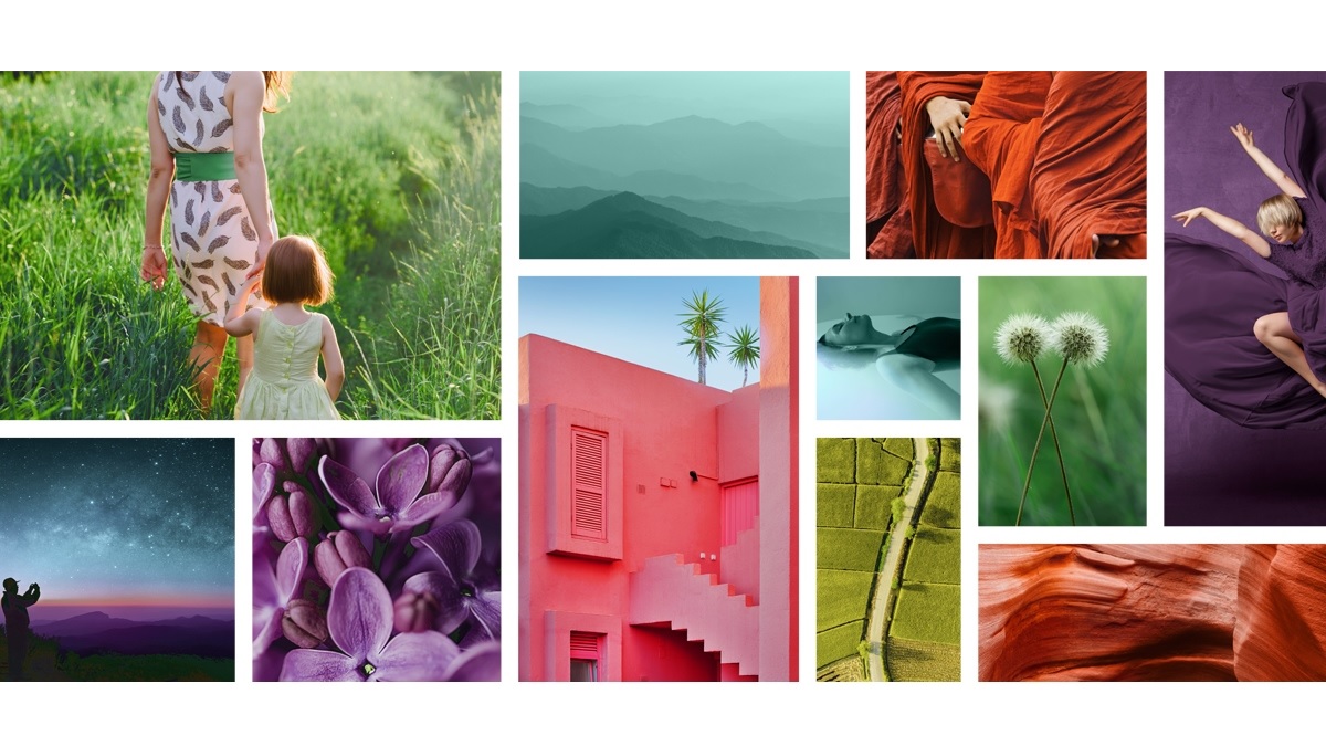
Harmonic Synergy is inspired by nature
For the Milliken ColorCollection 2021, the company has chosen natural designs be inspired. It wants them make visible with rich colours in ‚harmonious synergy‘. The colour palette ranges from the dark depths of planetary solar systems and the luminous contours of distant galaxies to the wonders of living structures:
- Summer Dawn (summer morning) is a Bright orange/red, that enlivens the morning sky and highlights the equally fascinating colours of the soft contours of the rocks formed under millions of glorious sunrises. At the same time, it is the colour of comforting warmth and visibly bubbling energy that increases with the power of a day full of structure and possibilities.
- Soothing Earth (earth rust) is a soft green, which depicts the structures of natural surface patterns on our planet. It takes us on a journey into a calm and serenity that reminds us of precious days in warm, green nature.
- Forest Walks (forest walk) is a more intense, lush green in harmony with the environment and surrounded by the clarity and support of the natural world. A strong signal colour with power and depth, it combines the reinterpretation of a classic choice with the subtle effect of a darker shade.
- Majestic Skies (sky height) reaches deep into the spectrum for a powerful and convincing Blue. It builds a bridge between the transience of human endeavour and the cosmos beyond. Inspired by the rich shades of emerging galaxies, this colour is ideal for products that place everyday life in a larger overall picture.
- River Calm (water stillness) is a sparkling, light and airy ocean blue. The visibly invigorating, bright and strong colour is neither piercing nor obtrusive. Instead, it conveys the message of connecting with the waters of life.
- Floral Song (Flower Song) combines a round dance of blossoms and laughter in a delicate bouquet of grounded, confident notes. As Deep, warm and appealingly rich purple colour the colour picks up on natural shades that connect and inspire.
- Proud Rose (Rosenstolz) is a breathtaking one, Bright pink, that radiates life and fearlessness and enriches our colour palette with the unforgettable characteristic of bold beauty. This makes this colour the perfect choice for products of all kinds that want to stand out from the crowd and delight our eyes with new life.
Source: Milliken