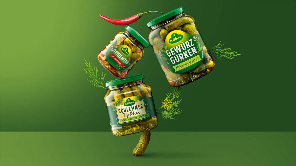
Contemporary, differentiating and characteristic - that was the idea behind the relaunch of the jars of Kühne gherkins. The packaging design agency Hajok took on this task and delivered.
The Kühne company was founded almost 300 years ago and the brand's pickled gherkins have been a firm favourite in German larders since 1903. To give the packaging design more clarity and modernity, the family-owned company commissioned the Hamburg agency HAJOK Design. The new appearance is characterised by a reduced, uniform and significantly younger design.
The information hierarchy has been changed to create a stringent visual guidance, as this is crucial for the purchase decision. The focus is now on the product name in bold lettering, with the varieties underneath in clear colour codes. The 31 different products have been given an unmistakable packaging design that impresses with its clarity and approachability on the shelf.

„With an all-time classic, you have to proceed sensitively in order to translate the design into the here and now. An exciting task that we successfully solved in close dialogue with our customer and the target group“
Jannika Plaas, Design Director at HAJOK