New packaging design for muesli classic

The Peter Schmidt Group has developed a new packaging design for Dr Oetker's Vitalis muesli, which is intended to create more orientation at the PoS.

In order to tap into new target groups and stay close to their customers, companies are constantly adapting the design of their brands and products. This is now also the case for Dr Oetker's Vitalis muesli brand. The new packaging design comes from the Peter Schmidt Group and is intended to provide better orientation at the point of sale.

Vitalis products are among the classics among mueslis in Germany - with a number of sub-groups that have grown over the years, such as crunchy muesli, less sweet or super muesli, which cater to specific trends and preferences. With the support of the brand and design agency Peter Schmidt Group Vitalis now brings new Tidies up the range, looks more modern and at the same time more enjoyable. All without straying too far from the established look.

„The modern and eye-catching look of the Vitalis range significantly increases visibility on the shelf. The colourful design makes it easier to differentiate between varieties, so that everyone can find their personal favourite muesli straight away.“

Veronika Kempf, Brand Manager at Dr Oetker

Display

Image of Vitalis muesli packaging in a new design
(Image: Peter Schmidt Group)

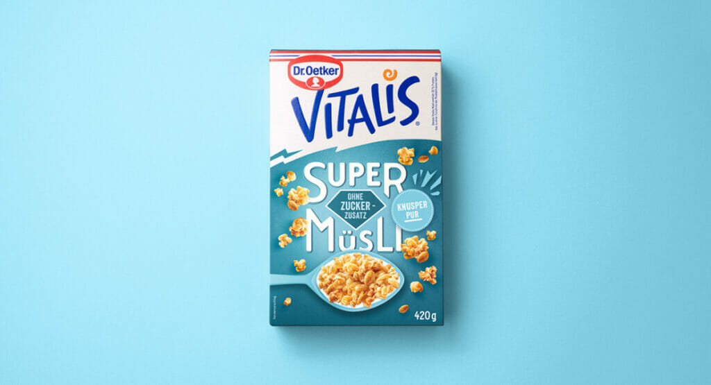
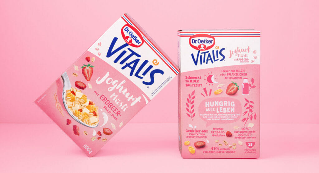
Over a period of one and a half years, the team led by Executive Creative Director Pedro Vilar and Design Director Ann Kalkschmidt overhauled the brand design. This also included the Modernisation of the logo and development of a new brand umbrella. The aim was to bring an unmistakable „Vitalis style“ to the products. Based on the new motto „Hungry for life“ developed by the BBDO agency, every design element of the packs has a zest for life: loosely distributed ingredients, appealing and explanatory illustrations and colourful accents. The individually designed brand umbrella emphasises the benefits of each product - be it with rough edges like the crunchy mueslis, a diamond associated with superheroes on the super mueslis or a cloudy design for the „Less Sweet“ range.

Picture of two muesli packets, one the front and one the back, leaning against each other
(Image: Peter Schmidt Group)

The backs of the packaging also invite muesli buyers to go on a voyage of discovery: They are designed to be illustrative and entertaining and bring little storytelling moments to the breakfast table. The Peter Schmidt Group has taken precisely this into account for Vitalis: with around forty different designs for the entire DACH region.

„Packaging is often underestimated in the media mix. From purchase to disposal, a muesli package is handled around forty times - and each of these contact points offers brands the opportunity to strengthen the emotional connection with the consumer.“ 

Ruediger Goetz, Managing Director of the Peter Schmidt Group

Source: Peter Schmidt Group

More messages Packaging design