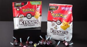
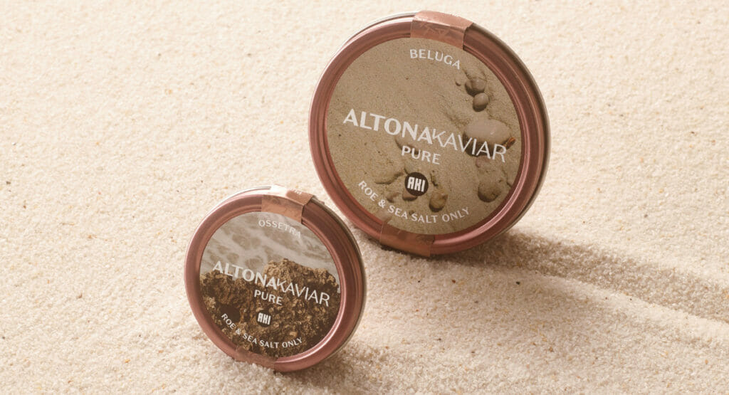
New packaging design for traditional brand

Altonaer Kaviar Import Haus worked with Mutabor on portfolio structuring, corporate design and packaging design. 

With a family history stretching back almost 100 years, the traditional Altonaer Kaviar Import Haus brand wants to look to the future and tap into new target groups. To this end, the company has worked with Mutabor on portfolio structuring, corporate design and packaging relaunch. 

The design of the new Signature line is a major change for the traditional luxury caviar market: Instead of classic splendour design, the focus is on soft natural tones and a visual world reminiscent of fashion photography. The aim of the new look and feel is also to carry the brand's almost 100-year history into the future.

„We no longer wanted to talk about the past, but rather about the future. That's why we developed a product line that visually and thematically departs from the myth of the old caviar world. The designs combine zeitgeist, naturalness and nonchalance. Things that were not primarily associated with caviar in the past. Mutabor has succeeded in expressing this new world through design. Every tin tells a story.“

Eva Maria Pankalla, Director Marketing & Communication at Altonaer Kaviar Import Haus (AKI)

Display

The new packaging design is aimed at additional target groups
(Image: Mutabor)

The iconic Logo has been rejuvenated, However, as a homage to the traditional past, it retains the charm of the early days. Eva Maria Pankalla comments: »AKI is positioning itself as a trailblazer for a new, relaxed caviar experience, without losing sight of respect for the „craft of caviar“. This opens the door for other - and I deliberately don't say younger - target groups and new multipliers in the food segment with high visual aesthetics.

„We accompanied the change at AKI from the strategic alignment of the brand and structuring of the broad portfolio to the corporate and packaging design and the refreshingly unconventional tone of voice from a single source. It was also an exciting challenge to accompany the launch of the new caviar bar in KaDeWe. We are delighted to support AKI on its way to making this special product accessible to a wider international audience.“

Moritz Carstens, Creative Director at Mutabor

Source: Mutabor

More news on packaging design

One hundred years blue tin

Since 1925, the Nivea cream can has borne its deep blue colour, white lettering and round shape - a design that has remained stable over generations, markets and crises and is now celebrating its 100th birthday.
Read more "