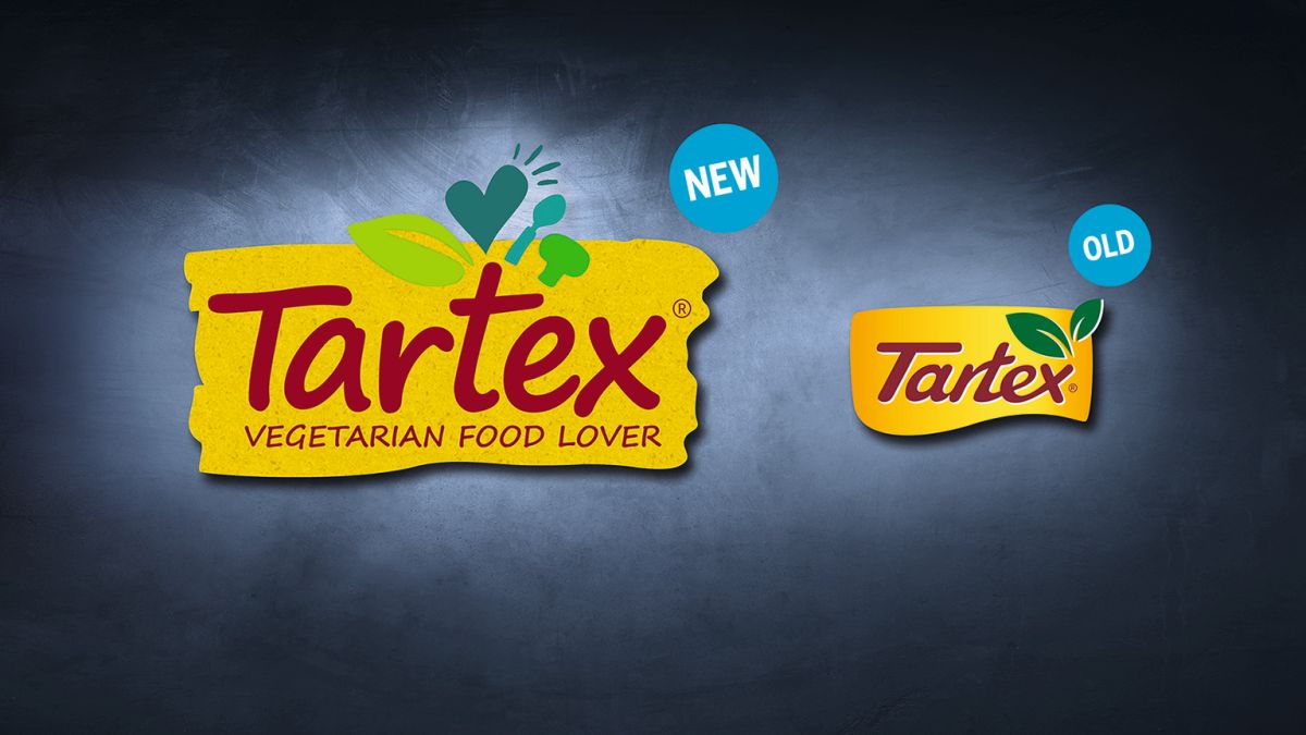
Customers of organic food shops may be familiar with the „Tartex“ brand. For many years, this brand's vegetarian spreads were only available in health food shops. Now Tartex is also aiming for the shelves of certain drugstores. In order to be successful there, the brand image has been revamped. The new claim „Vegetarian Food Lovers“ was accompanied by a new logo. The Hamburg-based brand agency Hajok Design helped with the strategic repositioning.
The Hamburg agency team set itself the challenge of revising the Tartex packaging designs The main task was to create a link between the packaging design and the new Claim to produce. „The claim ‘Vegetarian Food Lover' created by Hajok was to be realised through the packaging design.
uncomplicated and handmade,“ writes the agency. The claim was aimed at a young, nutrition-conscious target group. Tartex is convinced that this group can no longer be found only in organic food shops, but also in drugstores.

The logo font is now much closer
To ensure that consumers recognise the brand, the Tartex logo changed only cautiously. The warm yellow background has remained, as has the red name lettering. The new claim has been added, and the drawn elements above the lettering have also been changed. „The Typography is now much more approachable, and the small drawn elements above the logo represent the values of Tartex: 100 per cent organic, veggie and delicious,“ says Hajok Design Director Jannika Plaas.
For the design of the Product images On pouch packaging and glass labels, Hajok Design opted for natural illustrations of the foodstuffs contained, complemented by illustrations of the product ingredients grouped around them in a radial pattern. This Packaging design is unique and conveys the convictions of Tartex to the customer, is Hajok Design convinced. Customers experienced the brand as „stringent and authentic“.


