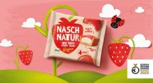
Award for Naschnatur redesign
The Hamburg-based brand agency Hajok Design has redesigned the packaging of the Naschnatur mini ice-cream cakes and has been honoured with the German Design Award.
Read more " 


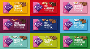
For almost 120 years, Alpia has stood for sweet chocolate indulgence in the unmistakable pink colour. A comprehensive brand and packaging relaunch was to rejuvenate and enhance the brand. With a clear structure, strong typography and modern staged photography, Hajok Design has developed a packaging design with its finger on the pulse of the times.
Combined with the respective variety colour, the characteristic pink remains as Alpia's feature and is brought into focus in an emotional way by the new brand pattern. The colour blocking also makes it easier to differentiate between the 12 different chocolate bars.

„Following the relaunch, the well-known Stollwerck brand has a more contemporary and self-confident image. We wanted to focus more on the iconic Alpine rue and the exciting product variety with special flavours such as Sunny Orange. The packaging now stands out much better on the shelf. This allows German consumers to rediscover Alpia as a strong and established brand.“
Dennis Dominguez, Design Director Hajok Design.
The Hajok team has been creating packaging designs for the Stollwerck company for three years now. In addition to Alpia, Hajok is also the lead agency responsible for the design of Sarotti Tiamo, Cherry N°, Eszet and Alpia Veggie Love, among others. The Alpia relaunch with a total of 12 bars and two snack varieties was the largest project to date.
Source: Hajok Design